The Do's and Don'ts of Logo Design
Logos are often the first touchpoint consumers have with your brand, making them the face of your brand. Creating a logo that is impressionable and long-lasting not only creates equity with your brand, but also develops a fierce and positive brand trust between your brand and your consumers. To ensure your logo will stand the test of time, make sure you know what to do and not do when creating a logo.
DO:
1. DO: Keep it legible. This logo is supposed to read "Finntroll" Couldn't read it? Me neither. To avoid this kind of confusion, we recommend avoiding typographic treatments that are too intricate, and opting for type that is simple and easy to read instead.
Example of what NOT to do. This image shows a VERY illegible logo.
2. DO: Consider scalability. You might only need your logo “on your business card and website” at the moment, but since you want this to be long-lasting, you need to consider that in the future, you might need to use it on a giant billboard. Or it might need to be shrunk to less than an inch, to fit alongside 20 other logos in a conference brochure. My point is, your logo should look great even when scaled. To ensure scalability, avoid small type/details that could be lost when scaled. Alternatively, create 'special situation logos' to use when the logo is under or over a certain size. Note the proper usage in your Brand Guidelines.
Example of special situation logo sizing.
3. DO: Have different logo lockups & color variations. Since your logo should be able to go on anything and everything, be sure to have vertical, horizontal and square lockups. Also include different color variations to ensure it stands-out over any background. Keeping these things in mind also protects your brand from printing limitations. For example, black/white printing, single-color printing, or 1-color embroidery on a merch item.

Example of showing logo versatility.
4. DO: Have a professional create your logo. Since it will be used on virtually every part of your brand, it's important to invest in creating a quality one now and not having to re-do everything in a couple of years. One of the best (or worst) examples is the historic GAP rebrand failure in 2010. After 20 years with a solid logo, the brand attempted to 'crowdsource' their rebrand, rather than hiring a professional branding team. Clearly that didn't work out. The rebrand is estimated to have cost them around $100 million & they reverted back to the old design only 6 days after the launch... ouch.

Epic brand failure in 2010 for Gap’s logo change.
DON'T:
1. DON’T: Make it too detailed/complex. Using too many colors, applying drop shadows, having too many words, or combining more than 2 fonts are all BIG no-no’s. Also, as mentioned before, a complex logo will lose its scalability. Small/complex details will often be lost or magnified under different contexts.
2. DON’T: Use imagery to replace text. It might seem clever to use imagery in replacement of text on your logo, but it's very difficult to pull off in a sophisticated manner and it can seriously affect legibility, like in these examples: Ulta could easily be mistaken for “Culta”, Iron Fest could be mistaken for “Ron Fest” and Smoke Shop for “moke hop”…or…continue reading for an even worse scenario…
3. DON’T: Forget to get a second opinion. The most unfortunate logos are logos that have a double-meaning, and are misconstrued because of the typeface, kerning, or general placement of objects. Double (or triple!) check with others before launching a new logo or rebrand.
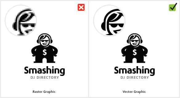
4. DON’T: Crowdsource your designs. As you saw above in the “Gap” rebrand example, hiring professionals in a MUST if you want a professional logo. I could go on and on about all the mistakes I see, but here’s one example: Logos should ALWAYS be created as vector files. So if you ask for the source file, and get a .PSD (Photoshop file) then your logo was probably made by an amateur. Vector logo files should be in .Ai, .EPS or .SVG but your designer shouldn’t be giving you ONE file, they should give you a full ‘Logo Set’ folder with alllll the files and formats you will need (so you don’t have to track them down years later) Your package should include both vector (.ai/.eps/.svg) and raster (.jpg/.png) file types, PLUS all your logo lockups and color variations.